Matthieu James
on 18 December 2013
During last month’s vUDS we showcased the latest design explorations for the new Ubuntu icon theme. Here is a summary of what we presented.
Our objectives
This project’s main goal is to create a single modern, high-resolution icon theme for desktop and touch devices that can adapt to various screen densities and reinforces the Ubuntu user experience. We want our icons to express our values and convey Ubuntu’s personality in a unique way.
We already had mobile icons for the applications and symbols, but, because they evolved over time without strong guidelines, did not form a consistent set. On the desktop, even though the style is clean and consistent, the icons looked dated and needed to be replaced too.
![]()
 The previous version of desktop, mobile and monochromatic icons
New icons
We’ve been working on this on-going project for the past year. We’ve done extensive research on the subject with a focus on learning how best to classify the icons; and we’ve gone through several design iterations and explorations.
So here is the latest iteration of the new icon set. As I’ve mentioned, these are all still subject to change as we’re constantly improving and refining the designs.
![]() Latest application icons
Latest application icons
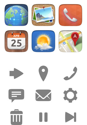
![]() Latest symbolic icons
Latest symbolic icons
![]() Icons in context — one of the latest design explorations of the dash
Icons in context — one of the latest design explorations of the dash
Next steps
The goals for 14.04 are to provide a new icon theme for mobile and tablet, and to provide guidelines with templates to help people to design consistent icons for their apps. We’d like to eventually implement the new set on the desktop too.
We’ve had lots of good feedback so far, and we’d like to get even more, so please let us know your thoughts in the comments!